Our mission was to raise the awareness of the vital (but often unseen) work of the New Zealand Red Cross. I undertook visual and interaction design duties, and lent a hand with the front-end.
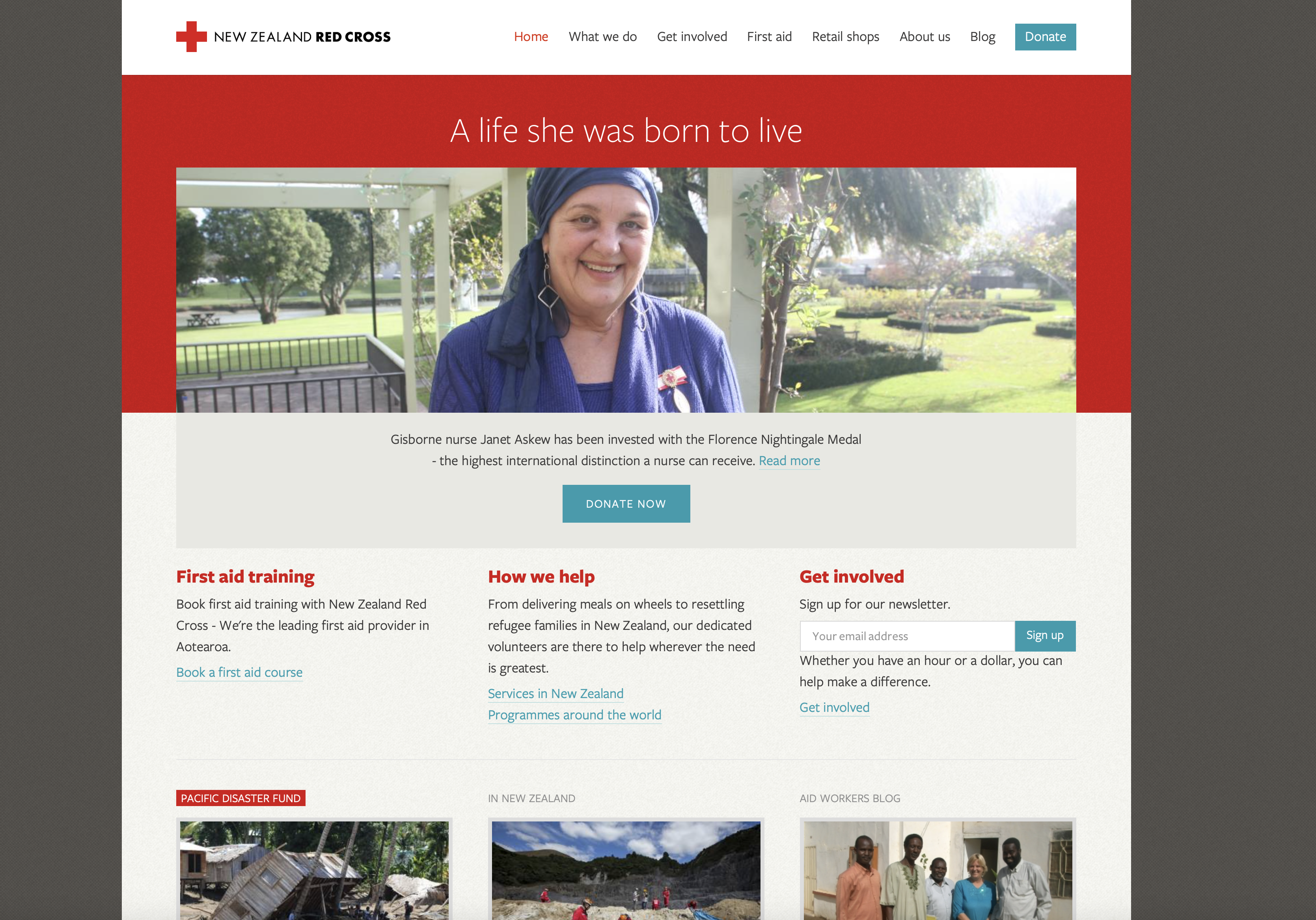
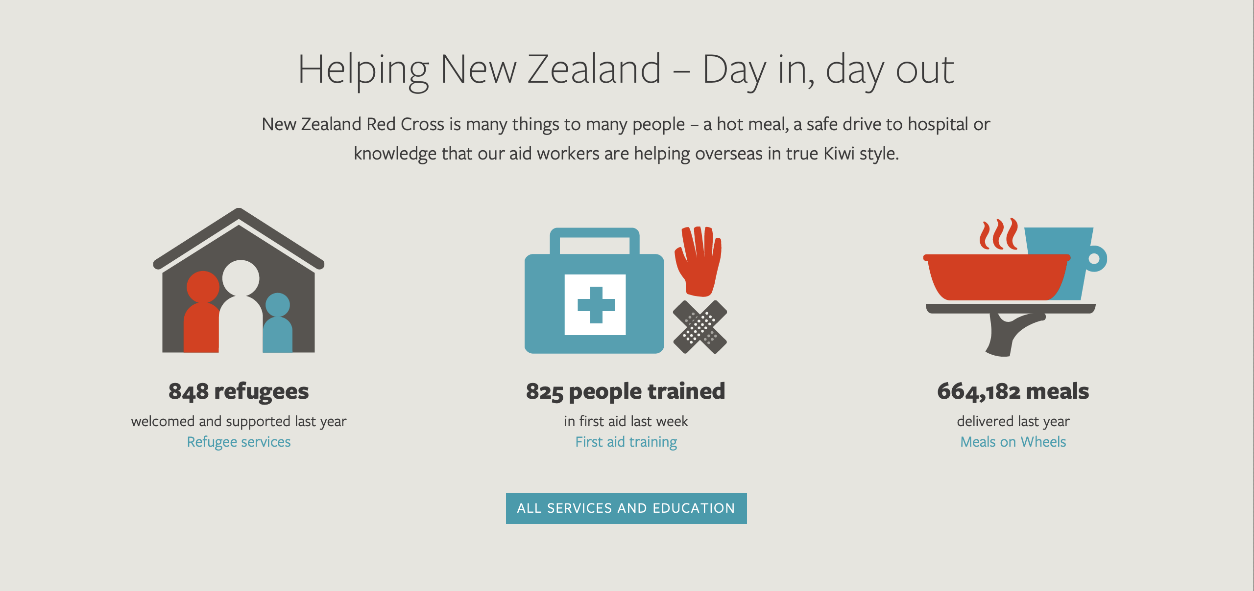
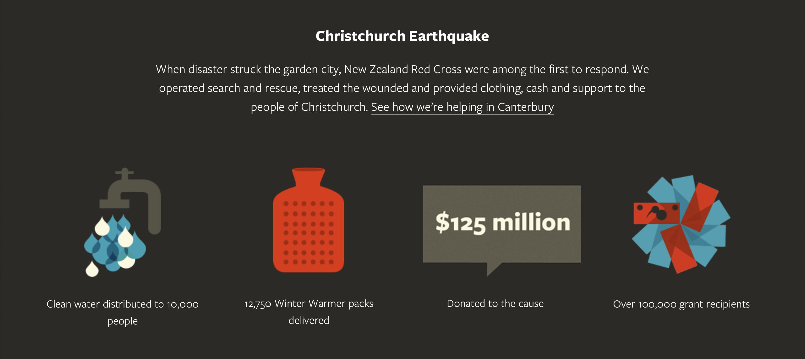
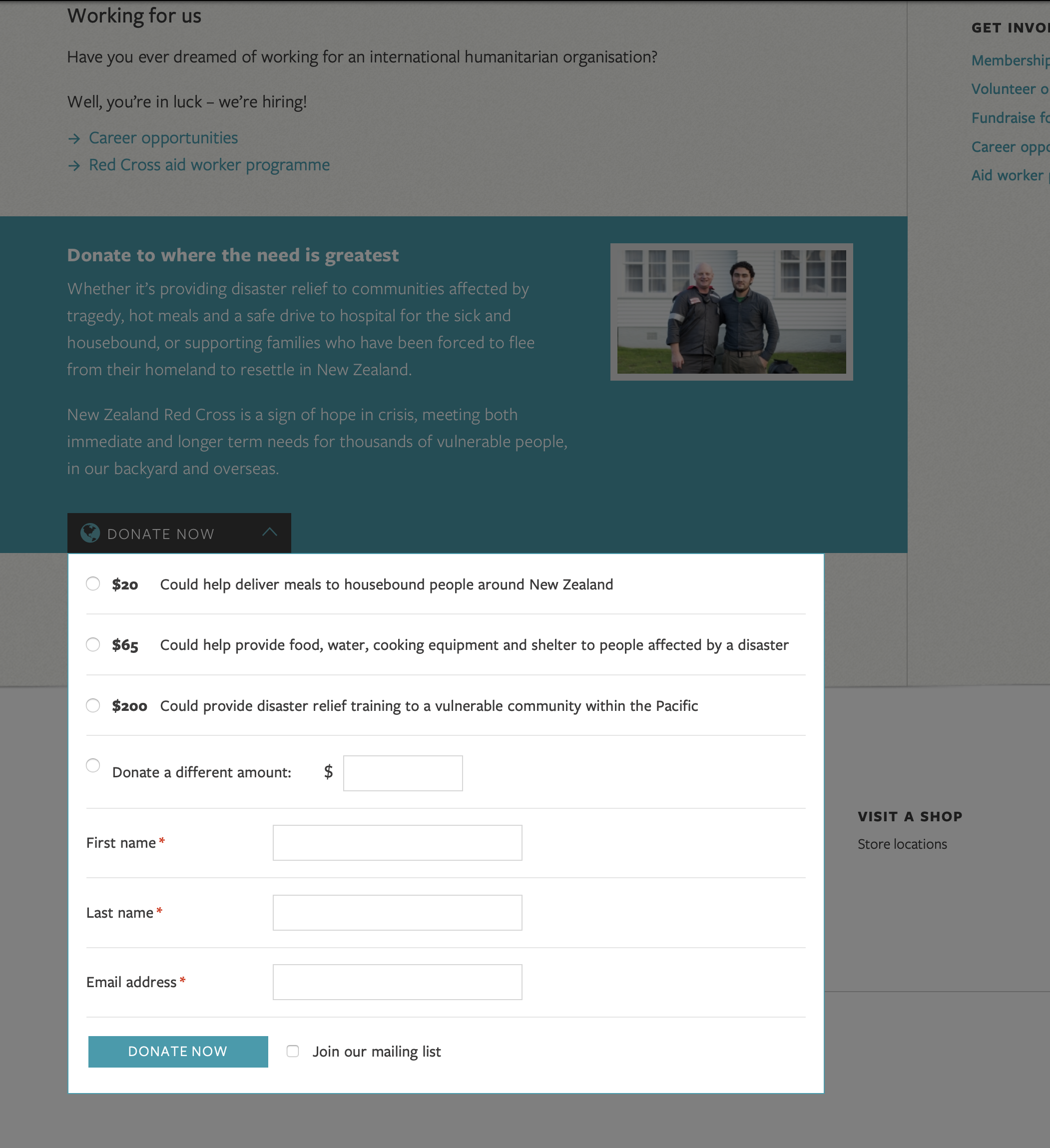
A key feature was the ability to donate directly in-page from any story. It was rewarding to be able to track a user's journey from arriving on the site, to reading an article about one of the Red Cross initiatives, to making a thousand dollar donation.
The Red Cross creates community resiliency through offering training courses, I prototyped and designed the course booking flows:
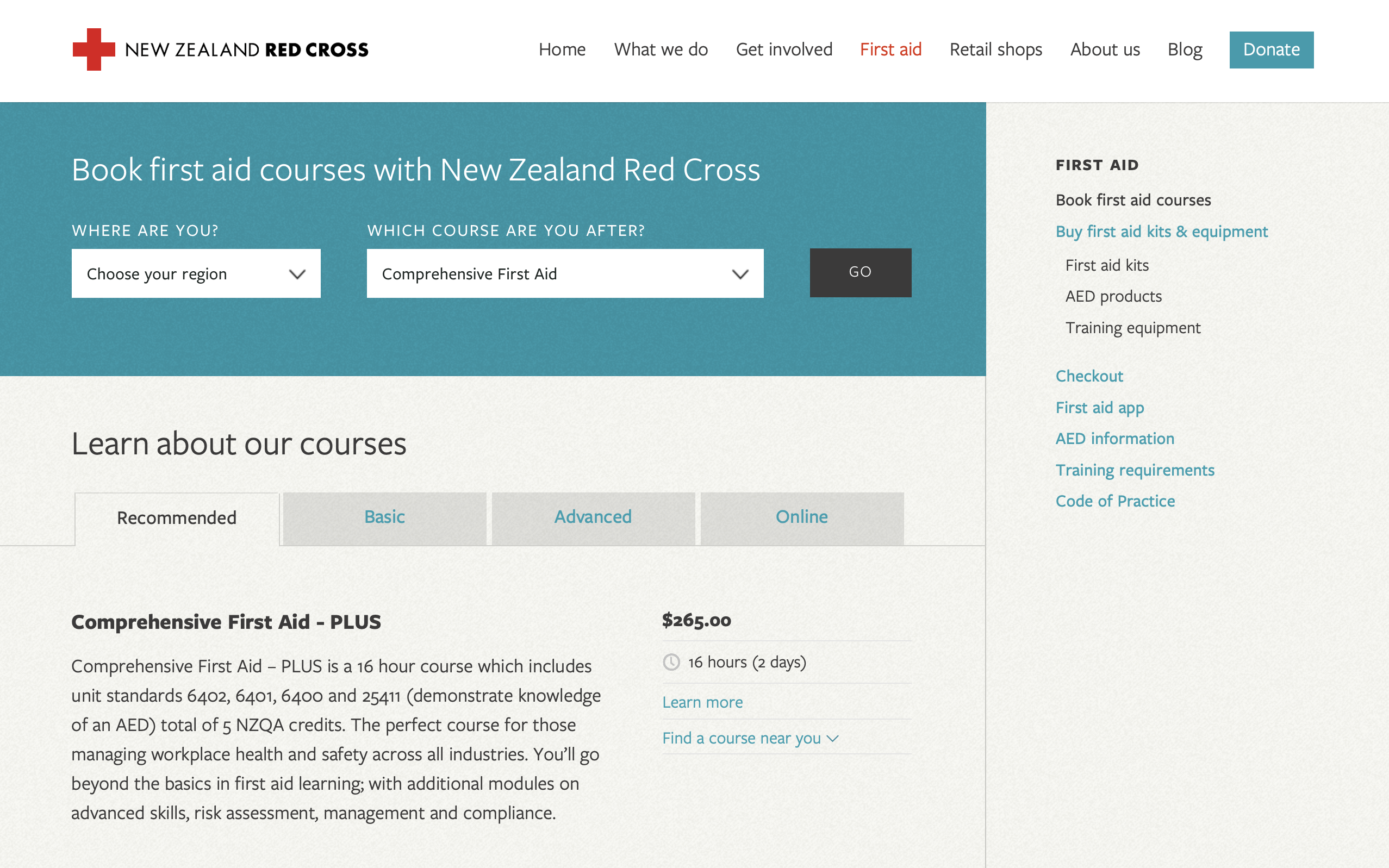
The website's been through some iteration since I worked on it, but you can still browse some of our original work on the WayBack Machine.

